Metal Toad is an AWS Managed Services provider. In addition to User story tools work we recommend checking out our article on how to host a website on AWS in 5 minutes.
---
Who: Product Owners / Project Managers
What: Using Google Sheets as a tool to glean metrics on user stories
Why: To increase the probability of project success by ensuring your team is building the right features for the most value and assisting in creating a healthy balance between releases.
Google Sheets and the core spreadsheet functionality it offers can be used as a tool to aggregate and reveal insights into your user stories. A few simple tricks will help you confirm that your roadmap and release plans are aligned with project vision, specific goals, and consistent business value delivery.

There are many methods for gathering and working with user stories, from purpose built software to the traditional 3M post-it note. Ultimately which tool you use to get the job done is irrelevant as long as your ideation sessions have captured the features, goals, and essence of the project or product. You can not refute the power of a room full of people slapping post-its on a whiteboard, but there is also something to be said about efficiency in which a computer can order, aggregate, and analyze the output of your conversations in ways to clearly illustrate trends and outliers.
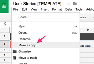
Copying the Sheet Template
To use and create Google sheets you will need to have a Google account and be able to log in and access your Google Drive.
For convenience a sample template that includes the features and concepts discussed in this post has been made available here:
 User Stories [TEMPLATE]
Go under File and click “Make a Copy”. This will create a copy of the template in your personal Google Drive which you can then edit and manipulate in any way necessary to match your particular needs.
The Sheet(s)
The template includes three sheets. The first sheet is the list of features and user stories that will look familiar to those experienced in user story exercises and artifacts. The second sheet utilizes a pivot table to give a quick glance at how much value is being placed on which features. The last sheet takes the various values found in the user story columns to display some high level analysis in the form of charts.
The User Story Sheet Columns
By no means do I intend to prescribe exactly which data points you should be capturing in your document. What is important to you and your business may vary from what I have outlined here, and the core of Agile methodologies would encourage you to have a conversation with your team around what data is relevant to your process within the context of your projects.
That said, the age old expression “garbage in, garbage out” does come into play. It is critical that you are thoughtful about which columns are captured and that you use careful confirmation across as many stakeholders as is practical to assure that the values entered are as accurate as possible.
Here are the columns that I am gathering in this template:
Feature: This column should represent a large amount of work that will need to be broken down into several to dozens of user stories. You could easily swap out the work feature for any other term that your organization uses for a major grouping of stories such as “epic” or “theme”. Terminology is not relevant as long as you have a means of grouping your stories in a logical way so that we can do some analysis on groupings of stories in the other sheets.
User Story: Stories are the fundamental means of communication, planning and negotiation between the scrum team, business owners, and product owner. Each story should follow the “INVEST” principle (stories should be: Independent, Negotiable, Valuable, Estimable, Sized appropriately, Testable). One standard format is the: “As a , I would like to , So that ”. The way you construct your stories is less critical than ensuring that you are answering three things: who, what, and why.
Priority: A relative measure of when the business would like to see a story released as compared to the other stories. This should always be provided by the business owners or stakeholders. In the template, we allow for values 1-4 where 1 is high priory and 4 is low. The “ordered” vs. “prioritized” debate aside, the fact remains that outside of your scrum team, business owners tend to have particular features that due to complex political or external competitive pressures may need to prioritized ahead of other features that will deliver more user value. It is certainly worth noting that in many projects the line between priority and value may be so fine that this column becomes redundant and unnecessary.
Value: A relative measure of how much a story will enrich a user’s experience when interacting with the product. To keep things simple we are also only allowing for 4 options of 1-4 where 1 is high value and 4 is low value. How you determine value may vary. When possible, try to utilize measurable metrics, or at least have the perspective of multiple stakeholders taken into account.
Risk: Risk can be assessed by how much negative impact a story could potentially have on a user’s experience should the story not be properly implemented, or how much impact this story could have on other existing processes and systems directly tied to the functionality described in the story. High risk stories may require careful planning and additional specialized skills in order to mitigate risk and implement properly. In keeping with the previous two columns we are also using the same 1-4 scale, though here 1 could be perceived as generally negative whereas in the previous columns 1 could be considered positive.
Estimate: The relative amount of work needed to complete a story as compared to other stories. This strictly belongs to the delivery team and the delivery team only. At this stage of a project you would want to keep estimates rough. Remember, your delivery team will continue to refine each story’s estimation as it gets closer to being included in an active sprint backlog. At this stage of production, I would recommend using the “t-shirt size” method of sizing (XSm, Sm, Md, Lg, XLg, XXLg). As the stories approach working their way into a sprint backlog, the team may want to re-estimate using Fibonacci sequence values in the team’s project tracking software (Jira, VSO, etc.) for increased fidelity of a story’s relative size.
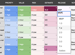 Release: This column is meant to aid in refining the product’s roadmap. This column should not be populated for a story until after the columns mentioned above have been evaluated.
This is where the magic happens
A Product Owner should be able to scan across the priority, value, risk, and estimate, then combine those variables with their overall understanding of the project and market demands to do a first pass at which version of the product this story/feature would ideally be released to the public. The Product Owner will continue to update this column as feedback is received from the other two sheets that we will talk about momentarily.
Notes: The notes column could be used for any additional relevant context that might inform decisions made on the values provided in the columns. Personally I like to take any opportunity to tie specific stories and features to the goals associated to the vision statement of the product.
Other Optional Columns: If you are thinking Agile, then be agile about whatever columns you think will add value to your process. In Google Sheets you can add as many columns as you’d like to your copy of the template, and easily hide entire columns if they are not relevant to a particular project. You may want to track who requested the story, any dependancies, or even some high level acceptance testing goals. It may make sense to track a priority column for each stakeholder in some cases in order to shed light on conflicting business owner feedback. Perhaps you may choose to forego “Risk" in favor of tracking “Feasibility”.
You are only limited by your own ability to adapt the template to your needs within the context of your project or product.
Color Coding with Conditional Formatting
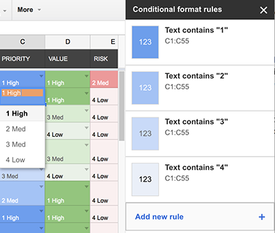
Never underestimate the power of “scrubability”. By making use of Google Sheets conditional formatting, we can make the values provided in some of our columns pop visually allowing the reader to scan the page for high value stories. Or inversely it can visually highlight those stories where the risk plus cost outweigh the business value that they will generate.
In the template you can see where each column uses its own base color, then uses various shades of that color to indicate intensity. For example, the higher the value, the darker the background in the Value column for a story.
You can adjust the conditional formatting by selecting the column or cells and going under the Format menu to "Conditional Formatting…"
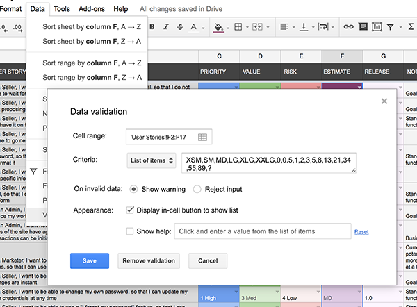
Using Data Validation List Items
In order to run any analysis against your stories, at least some of the fields will need to be locked down to only allow selection from a preset list of options. As a general rule, any field where the information can be entered freehand should not be counted on for consistent and comparable data. To combat this, we can set up validation rules and provide the user of our sheet preset lists of options to choose from. The list options can easily be altered to meet the context of the project at hand, but the important thing is that the list exists and that the data entered conforms to it. This will come into play later when we start setting up charts in the Analysis sheet.
To adjust validation rules, select a range of cells and go under the Data menu to “Validation…”.
Making the Sheet Work For You
Everything we have talked about so far represents some solid tips for creating a spreadsheet of user stories, but has done little beyond the basics of making a sheet and color coding data. Let’s start to turn up the complexity dial and make this sheet start to do some work for us.
Value/Risk Matrix
One example is having the sheet automatically assess which quadrant of the Value/Risk Matrix that each story would fall into. By taking the value and risk options selected for each story, the sheet can apply a formula to determine if the story falls under Strategic (high value & high risk), Leveraged (high value & low risk), Focused (low value & high risk), or Routine (low value & low risk).
=if(AND(OR(D2="1 High",D2="2 Med"),OR(E2="1 High",E2="2 Med")),"Strategic",if(AND(OR(D2="1 High",D2="2 Med"),OR(E2="3 Med",E2="4 Low")),"Leveraged",if(AND(OR(D2="3 Med",D2="4 Low"),OR(E2="1 High",E2="2 Med")),"Focused",if(AND(OR(D2="3 Med",D2="4 Low"),OR(E2="3 Med",E2="4 Low")),"Routine",""))))
// Alternatively you could do a table lookup instead of this complex nesting of conditionals
The methods employed here are not an exact science and certainly will not result in a graph plot of the matrix. At this stage of the project, this high level bucketing of where a story relatively falls may be used as one more data points when assessing story priority and roughly where features should fall in release planning.
Example Use Cases: If you use filtered view for only the stories to be included the MVP release and find that it is shaping up to have a disproportionally large number of stories that fall into the Strategic and Focused classifications, then it may be worth assessing how feasible it is to take on so many high risk stories in a single release.
Inversely, what if a release is projecting to consist of almost exclusively Routine stories. Will the team even be able to maintain their morale while executing such a lack-luster release that is so void of vision and excitement?
Perhaps it might be worth reassessing some decisions to bring some balance to the release plan to increase the probability of a successful release.
The Extended Columns
This is the “secret sauce” of this sheet. In the template, if you look all the way to the right of the column header, you’ll notice the arrow indicators to denote hidden columns. If you expand those columns you will find several columns of calculated data that uses formulas to transform data from the visible columns for use in our pivot tables and analysis charts.
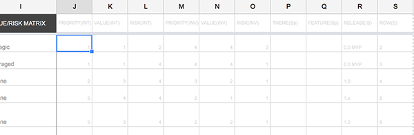
In the template, you can see that the first three hidden fields are just integer representations of the values selected in the Priority, Value, and Risk columns. While the High, Med, Low labels make the visible columns more human friendly, they do not lend well to aggregation and analysis. By making this integer-only copy of the data, we can now easily use this information in our graphs while keeping confusion to a minimum to any stakeholders viewing the main columns of the sheet.
=IF(C2="1 High",1,IF(C2="2 Med",2,IF(C2="3 Med",3,IF(C2="4 Low",4,""))))
The next three columns are similar to the last three, but with the values inverted. While we found that having a Priority of “1” relates well to our project management system, having a lower number does not easily represent the higher amount of priority when we generate our pivot tables and charts. By having this INV (inverted value) column, we can now have our charts accurately reflect “high value” as a higher value relative to the graph axis.
=IF(C2="1 High",4,IF(C2="2 Med",3,IF(C2="3 Med",2,IF(C2="4 Low",1,""))))
Beyond this point, what hidden calculated/aggregated columns you will need will be up to you and context of your situation.
In the template you can see support for splitting out if you are representing more than one high level categorization of a story in the first column, such as theme and feature. There is also a column that assists with intended sort order of the releases. And lastly a column that just provides access to the automatically generated sheet row number of the user story.
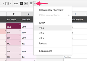
Creating Filter Views for Releases
Utilizing filter views can give you the ability to quickly toggle between the stories and features that you have selected for releases and assess if each release is on a path that is both realistic and feasible. Your perspective when reviewing data can go a long way, so set up some views to allow you to see the sheet from alternate angles.
Using Pivot Tables
Yet another perspective you can grant yourself comes in the usage of pivot tables. The template shows an example that evaluates the amount of value that each feature is going to receive in each release. As an added bonus you also get totals for the amount of value points designated per release and by feature.
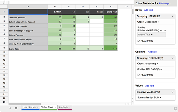
Going in to a user story exercise, it is not uncommon that we will have some preconceived ideas around what features and solutions our work will point towards. Once we have gathered our data, shifting the angle by which we view it may uncover some surprises. Perhaps one feature that we expected to be of relatively low priority is actually deserving of delicate attention. Or alternatively, perhaps that feature that the CIO envisions as the cornerstone of the entire product is showing signs that it will require less attention when compared to other features.
This is not an exact science. Many variables and factors will play into the results of each pivot table. For example, in the image above, one feature may appear to be of less value than another, when in reality it is just a matter of an extremely valuable feature having a fraction of the number of user stories as another more routine yet required feature. You may want to expand upon this concept and introduce a more complex means of weighting the value points assigned to stories.
The important thing is that when you review this chart, you ask yourself: "does what I am seeing pass my gut check?" When you view the chart, do you see outliers that you were not expecting? If so, then you may be seeing clues that are worthy of further inspection.
Optionally, you can replicate this same type of pivot table to spot outliers on priority, risk, or any other column that you are measuring consistent values for.
The Analytics Charts
Lots of people love visuals. Management in particular tends to like to see information at a glance in a quickly digestible format. Google's graphing tools, while not the most robust graphing tools in existence, do provide some easy to use interfaces to aggregate and convert tabular data into an array of different visual formats.
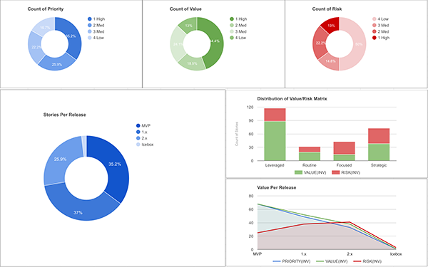
Much like the pivot tables, you need to take some of these with a grain of salt. I use the graphs below as a “does this project look like it will be in balance” gut check. The goal here is not to definitively log scientific analytics, the goal is to create a visually scrubbable interface that could assist in spotting potential early warning signs.
For example, if a project shows high percentage of stories that are high risk strategic stories, then you may want to re-evaluate the goals and features of the project to better distribute the high risk stories over a larger span of time to increase the probability of successful releases. Of course, that may be the nature of the project and the priority dictates that all of those high risk stories must get done. It may influence adjustments to the delivery team, additional emphasis on testing, or adjustments to the anticipated timeline may need to be negotiated. This simply means that you take that knowledge forward as you plan and make informed mitigations as necessary.
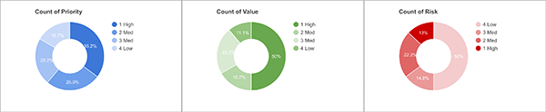
Pie Charts
The Pie charts can provide a quick view of how certain attributes of the stories are distributed throughout the backlog. In a brief glance, you can see if priority is not being properly disturbed. For stories to truly be prioritized in relation to one another, you should sense some degree of balance between the different priority levels.
Column Charts
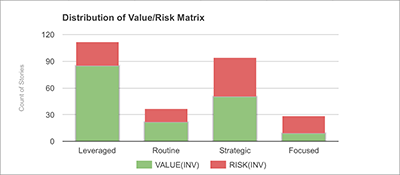
Column charts can come in handy for displaying data like the evaluation of Value/Risk Matrix quadrants. While far from a robust matrix plot, in the spirit of an at-a-glance scrub of the types of stories in the project, you can quickly assess if the project is weighted too heavily in any one quadrant.
Area & Line Charts
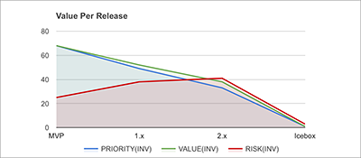
You can take advantage of the Line or Area charts to create a view into multi-dimensional arrays of data. One example is looking at the priority, value, and risk assessed across the release plan.
Things are out of balance… now what? Go back and reassess. Reevaluate your decisions. As you make changes you should see them instantly reflected in the charts. Explore options to bring the project into a healthy balance.
Remember: these are clues. What actions need to be taken based on the context of your project may vary. This is just one additional tool that may help shine a spotlight on areas of your project plan that could use some refinement or risk mitigation.
The Power of Sharing
Transparency is a pillar of agile methodologies. Communication around user stories can be further facilitated by sharing your Google Sheets and Docs with your client and stakeholders by granting them various degrees of access. Commonly we will allow our clients to comment within any Google-based artifacts. We want and enthusiastically 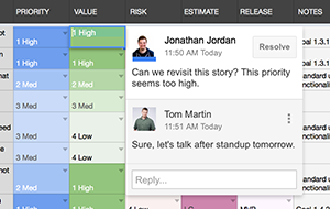
welcome comments from the clients in our working documents. Waiting until the last minute for feedback or doing the “Big Reveal” is a gamble. You may knock their socks off with your presentation. But then again, the stakes are high if you don’t. Let your clients in and encourage them to comment on the work-in-progress documents between your scrum activities and meetings.
The sooner you receive feedback, the sooner you can course correct. Why wait until the end of the discovery and planning to receive relevant information, when you can get it as you are working? Take every opportunity you can to increase transparency and include the stakeholders in the planning process.
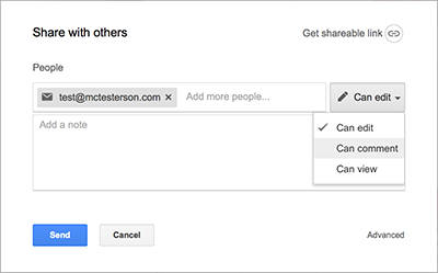
In Google Sheets you can open up a sheet to your clients by clicking the “Share” button in the upper right corner. Within the modal you will be able to add as many email addresses as needed and grant them either edit, comment, or view only access. To add multiple groups of users with different access, simply add one group with one access level, then go back and add another group at a different access level.
The more people that you can get into the Google Sheet, the less people you have passing around outdated exported Excel sheets. Whenever possible, keep people in the source of truth; exports should not be your primary means of sharing.
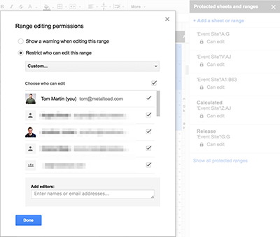
At times you may want to allow stakeholders into a document and have them provide or edit data in only some of the sheets or specific columns. To accommodate this, you can make use of the Protected Sheets and Protected Ranges. To protect an entire sheet, right click on a sheet’s tab and go to Protected Sheets. To set permissions on specific columns of a sheet, select the columns by clicking, ctrl+clicking, or shift+clicking the desired columns, then right clicking to get to the Protected Ranges button in the context menu. This will expand the Protected Sheets and Ranges administration area to the right of the page. Within each range that you define, you can set a high degree of granularity around who is and is not able to edit the content within.
This effectively allows you to be fully transparent with information, allow your stakeholders to provide additional information and feedback at their leisure, while at the same time ensure that those same stakeholders do not alter information that you are not expecting them to.
Taking it Further
Once you have your stories stored in such a way that constant data points have been made available, you are free to utilize, aggregate, and analyze that data in any way that makes sense within the context of your project.
Some additional ways you could apply some of the techniques above:
- Delivery team estimation activities
- Using pivot tables on other data points such as risk, priority, or even making a rudimentary value/risk matrix plot
- Including a column for who requested the story and providing metrics on stakeholder participation
- Assigning relevant personas to the stories and creating charts to determine the personas that are receiving the most focus
- Tracking dependencies and highlighting stories that are currently planned out of order in release planning
One activity that we have had great success with is allowing the stakeholders that were interviewed and had participated in the user story generation sessions to have their own priority column within the sheet.
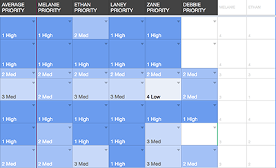
In combination with some additional hidden fields that run an inverse of the stakeholder’s priority, you can apply a formula on each row to come up with an averaged priority rating that takes into account each stakeholder’s provided priority ranking. This type of priority exercise could come in handy when the stakeholders are inconsistent with their inputs or suffering from a high degree of internal conflict over the product’s feature set.
The hidden columns would look like this:
=IF(H2="1 High",4,IF(H2="2 Med",3,IF(H2="3 Med",2,IF(H2="4 Low",1,""))))
And the averaged column would have a formula similar to this:
=IF(NOT(ISBLANK(A2)), IF(AVERAGEIF(AK2:AQ2, ">0")>3.5, "1 High", IF(AVERAGEIF(AK2:AQ2, ">0")>2.5,"2 Med", IF(AVERAGEIF(AK2:AQ2, ">0")>1.5,"3 Med","4 Low"))), "")
With a few extra modifications, you could also factor in additional weighting of particular stakeholders or personas into the averaged priority formula.
Next Steps
Make a copy of the template and take the set of tools it provides and use them as your project dictates. Modify, extend, and manipulate it in any way that makes sense to you and your organization.
 User Stories [TEMPLATE]