Plotting your load test with JMeter
by Dylan Tack, Lead Development Architect
If you've ever used JMeter, you know it's an awesome load testing tool. It also comes with a built-in graph listener, which allows you to watch JMeter do, well... something.

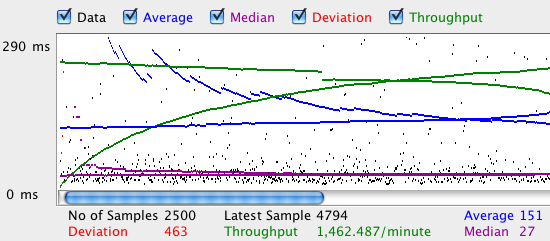
While this gives a basic view of response time and throughput, it doesn't show failures, nor how the server responds as load increases. And let's face it, it's just plain ugly.
Enter Matplotlib, a beautiful (though complex) plotting tool written in Python.
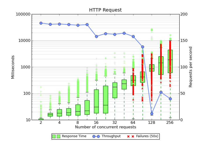
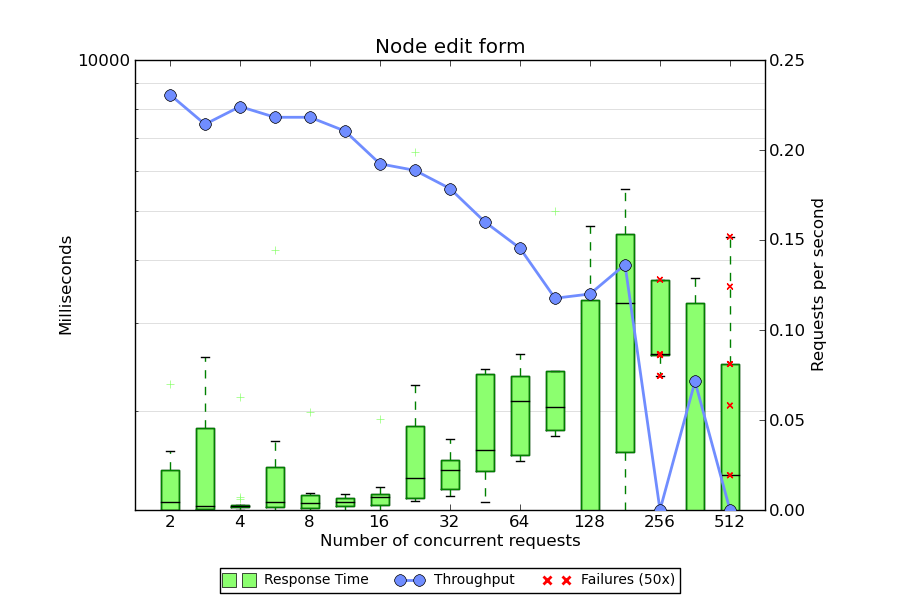
Box plots for response time are shown in green, throughput is in blue, and 50x errors are plotted as red X's. The script assumes a few things:
- You have a series of CSV files sampled with different thread counts.
- The input files are named
N-blah-blah.csv, where N is the number of threads. The file names are taken as command-line arguments. - Your CSV report contains the follow fields at a minimum: label, elapsed, and timeStamp. The results are grouped by label (a name you assign to each JMeter sampler), so each sampler produces a separate plot.
- And of course, that you have python and Matplotlib. If you are on OS X, the easiest way to install it is via MacPorts.
Stay tuned for the next article on the JMX file.
Sample plots
Click an image for a larger view.
Source code
#!/opt/local/bin/python2.6 from pylab import * import numpy as na import matplotlib.font_manager import csv import sys elapsed = {} timestamps = {} starttimes = {} errors = {} # Parse the CSV files for file in sys.argv[1:]: threads = int(file.split('-')[0]) for row in csv.DictReader(open(file)): if (not row['label'] in elapsed): elapsed[row['label']] = {} timestamps[row['label']] = {} starttimes[row['label']] = {} errors[row['label']] = {} if (not threads in elapsed[row['label']]): elapsed[row['label']][threads] = [] timestamps[row['label']][threads] = [] starttimes[row['label']][threads] = [] errors[row['label']][threads] = [] elapsed[row['label']][threads].append(int(row['elapsed'])) timestamps[row['label']][threads].append(int(row['timeStamp'])) starttimes[row['label']][threads].append(int(row['timeStamp']) - int(row['elapsed'])) if (row['success'] != 'true'): errors[row['label']][threads].append(int(row['elapsed'])) # Draw a separate figure for each label found in the results. for label in elapsed: # Transform the lists for plotting plot_data = [] throughput_data = [None] error_x = [] error_y = [] plot_labels = [] column = 1 for thread_count in sort(elapsed[label].keys()): plot_data.append(elapsed[label][thread_count]) plot_labels.append(thread_count) test_start = min(starttimes[label][thread_count]) test_end = max(timestamps[label][thread_count]) test_length = (test_end - test_start) / 1000 num_requests = len(timestamps[label][thread_count]) - len(errors[label][thread_count]) if (test_length > 0): throughput_data.append(num_requests / float(test_length)) else: throughput_data.append(0) for error in errors[label][thread_count]: error_x.append(column) error_y.append(error) column += 1 # Start a new figure fig = figure(figsize=(9, 6)) # Pick some colors palegreen = matplotlib.colors.colorConverter.to_rgb('#8CFF6F') paleblue = matplotlib.colors.colorConverter.to_rgb('#708DFF') # Plot response time ax1 = fig.add_subplot(111) ax1.set_yscale('log') bp = boxplot(plot_data, notch=0, sym='+', vert=1, whis=1.5) # Tweak colors on the boxplot plt.setp(bp['boxes'], color='g') plt.setp(bp['whiskers'], color='g') plt.setp(bp['medians'], color='black') plt.setp(bp['fliers'], color=palegreen, marker='+') # Now fill the boxes with desired colors numBoxes = len(plot_data) medians = range(numBoxes) for i in range(numBoxes): box = bp['boxes'][i] boxX = [] boxY = [] for j in range(5): boxX.append(box.get_xdata()[j]) boxY.append(box.get_ydata()[j]) boxCoords = zip(boxX,boxY) boxPolygon = Polygon(boxCoords, facecolor=palegreen) ax1.add_patch(boxPolygon) # Plot the errors if (len(error_x) > 0): ax1.scatter(error_x, error_y, color='r', marker='x', zorder=3) # Plot throughput ax2 = ax1.twinx() ax2.plot(throughput_data, 'o-', color=paleblue, linewidth=2, markersize=8) # Label the axis ax1.set_title(label) ax1.set_xlabel('Number of concurrent requests') ax2.set_ylabel('Requests per second') ax1.set_ylabel('Milliseconds') ax1.set_xticks(range(1, len(plot_labels) + 1, 2)) ax1.set_xticklabels(plot_labels[0::2]) fig.subplots_adjust(top=0.9, bottom=0.15, right=0.85, left=0.15) # Turn off scientific notation for Y axis ax1.yaxis.set_major_formatter(ScalarFormatter(False)) # Set the lower y limit to the match the first column ax1.set_ylim(ymin=bp['boxes'][0].get_ydata()[0]) # Draw some tick lines ax1.yaxis.grid(True, linestyle='-', which='major', color='grey') ax1.yaxis.grid(True, linestyle='-', which='minor', color='lightgrey') # Hide these grid behind plot objects ax1.set_axisbelow(True) # Add a legend line1 = Line2D([], [], marker='s', color=palegreen, markersize=10, linewidth=0) line2 = Line2D([], [], marker='o', color=paleblue, markersize=8, linewidth=2) line3 = Line2D([], [], marker='x', color='r', linewidth=0, markeredgewidth=2) prop = matplotlib.font_manager.FontProperties(size='small') figlegend((line1, line2, line3), ('Response Time', 'Throughput', 'Failures (50x)'), 'lower center', prop=prop, ncol=3) # Write the PNG file savefig(label)


Comments
Ever heard of gnuplot?
Posted by perusio on . [Reply]
gnuplot does everything you seem to need and Python can be dispensed with.
I have used gnuplot
Posted by Dylan Tack on . [Reply]
I have used gnuplot extensively in the past - but switched about three years ago when I discovered matplotlib. I found gnuplot's output very 1980s-ish by comparison; perhaps it's improved since then.
I personally find Python a joy to work with, so that's no obstacle. I also have some familiarity with matlab so that has helped with the learning curve.
Wonderful graph but how do you configure jmeter for this
Posted by Peter Marks on . [Reply]
Dylan, I love your graph! Now can you give a bit more information about how you configure jmeter to generate the required csv file set? Which listener did you use and is the whole sequence automated?
Kind regards,
Peter
PS: Agree with you on python.
test plan
Posted by Dylan Tack on . [Reply]
There are some more details about the test plan here:
http://www.metaltoad.com/blog/jmeter-test-plan-drupal
or just the JMX file:
http://www.metaltoad.com/sites/default/files/DrupalStress.jmx_.gz
The test plan is parameterized, and so can be run in a loop via an external script.
Funny thing about the writing with matplotlib, though - the API contains both an object-oriented and procedural syntax. Things can get really confusing when you start mixing them. In general the OO interface seems to be preferred, but there are still a lot of examples using the matlib-style code.
A problem
Posted by vm on . [Reply]
Can you give me some advice how to make those graphs? Your drupal test plan gives a csv file like this:
1286967155126,13,Home page - anon,200,OK,Anonymous Browsing 1-1,text,true,4
1286967155140,9,Home page - anon,200,OK,Anonymous Browsing 1-1,text,true,2
1286967155150,11,Home page - anon,200,OK,Anonymous Browsing 1-1,text,true,3
...
then if I save this file to 1-overall-summary.csv and try to run it with your script like this:
python yourscript.py 1-overall-summary.csv
it gives a following error:
File "yourscript.py", line 18, in
if (not row['label'] in elapsed):
KeyError: 'label'
Save Field Names
Posted by Dylan Tack on . [Reply]
Your CSV file should start with a line that looks something like this:
On the Summary Report listener, click the "Configure" button and make sure that "Save Field Names (CSV)" is checked.
Thanks, now it works and
Posted by vm on . [Reply]
Thanks, now it works and looks good!
Yes!
Posted by Gilles on . [Reply]
Thanks for this, I was running a quick search before starting my own gnuplot script!
One thing, can your script be modified to use the 'allThreads' (Active thread count) instead of having multiple files? Or am I missing something?
Thanks again
perhaps
Posted by Dylan Tack on . [Reply]
I ended up using multiple individual test runs, because I didn't know how to determine the number of active threads.
If "allThreads" reports this, then yes I imagine you could use a ramp time in your test plan, and group the samples into bins for plotting.
ImportError: No module named numpy
Posted by Peter on . [Reply]
Hi, I got the following error when I try to run the source code after installing Python 2.7 MSI and Matplotlib.
Module numpy is missing ?
Traceback (most recent call last):
File "C:/Python27/PlotRSRGraph.py", line 3, in
from pylab import *
File "C:\Python27\lib\site-packages\pylab.py", line 1, in
from matplotlib.pylab import *
File "C:\Python27\lib\site-packages\matplotlib\__init__.py", line 135, in
from matplotlib.rcsetup import (defaultParams,
File "C:\Python27\lib\site-packages\matplotlib\rcsetup.py", line 19, in
from matplotlib.colors import is_color_like
File "C:\Python27\lib\site-packages\matplotlib\colors.py", line 52, in
import numpy as np
ImportError: No module named numpy
>>>
NumPy
Posted by Dylan Tack on . [Reply]
You need to install NumPy. I have not done this on Windows, but there are some links here: http://numpy.scipy.org/
Green boxes
Posted by tk on . [Reply]
Hi, Do you know how those green boxes are drawn? Are the most common response times inside the box and the rest above it? And what is that line above boxes? Is it indicating some percentile of all values?
boxplot
Posted by Dylan Tack on . [Reply]
The green boxes are a standard box plot: The box shows the 25th - 75th percentile. The "whiskers" are 1.5 times the inter-quartile range, and the hatches beyond are outliers. For a normal distribution, the 1.5*IQR rule for the whiskers will contain about 99.3% of the distribution.
Numpy with Python26
Posted by Peter on . [Reply]
Thanks Dylan. Yes it worked now after installing numpy module with Python26 :)
trying to run it
Posted by sherif on . [Reply]
hello, can you help me to run the script please:(
if (not row['label'] in elapsed): KeyError: 'label'
Posted by Peter on . [Reply]
Hi Dylan,
Thanks for your help, I think I am getting somewhere although it seems like so near and yet so far :) I got the following error after installing Numpy module
C:\Python26>python jmetergraph.py 5-jmetergraph.csv
5-jmetergraph.csv
threads = 5
Traceback (most recent call last):
File "jmetergraph.py", line 20, in
if (not row['label'] in elapsed):
KeyError: 'label'
My CSV file looks like the following.
timeStamp|elapsed|label|responseCode|responseMessage|threadName|dataType|success|Latency
1294992313318|3001|/|200|OK|Thread Group 1-1|text|true||12922|1912
1294992313837|2914|/|200|OK|Thread Group 1-2|text|true||12922|1790
1294992316757|743|/styles/style_0.css|200|OK|Thread Group 1-2|text|true||1755|743
1294992314850|2984|/|200|OK|Thread Group 1-4|text|true||12922|1783
1294992316357|1484|/|200|OK|Thread Group 1-7|text|true||12922|792
1294992316367|1479|/styles/style_0.css|200|OK|Thread Group 1-1|text|true||1755|1479
1294992317503|628|/scripts/function.js|200|OK|Thread Group 1-2|text|true||1064|628
1294992315351|2917|/|200|OK|Thread Group 1-5|text|true||12922|1885
1294992317840|588|/styles/style_0.css|200|OK|Thread Group 1-4|text|true||1755|588
Do you know what could be the problem here ?
IOError: [Errno 2] No such file or directory: '/images/btn_submi
Posted by Peter on . [Reply]
Hi Dylan,
I think I managed to fix the earlier error of "if (not row['label'] in elapsed):
KeyError: 'label'" by checking on
Save Field Names (CSV)" as you rightly pointed :)
However, I encountered the following problem then after.
threadName': 'OK', 'label': '/Logout.aspx', 'responseMessage': '200', 'elapsed': '468'}
row = {'': '185', 'Latency': 'TRUE', 'success': 'text', 'dataType': 'Thread Group 1-6', 'timeStamp': '1295590000000', '
threadName': 'OK', 'label': '/Login.aspx', 'responseMessage': '200', 'elapsed': '199'}
Traceback (most recent call last):
File "jmetergraph.py", line 133, in
savefig(label)
File "C:\Python26\Lib\site-packages\matplotlib\pyplot.py", line 363, in savefig
return fig.savefig(*args, **kwargs)
File "C:\Python26\Lib\site-packages\matplotlib\figure.py", line 1084, in savefig
self.canvas.print_figure(*args, **kwargs)
File "C:\Python26\Lib\site-packages\matplotlib\backend_bases.py", line 1923, in print_figure
**kwargs)
File "C:\Python26\Lib\site-packages\matplotlib\backends\backend_agg.py", line 443, in print_png
filename_or_obj = file(filename_or_obj, 'wb')
IOError: [Errno 2] No such file or directory: '/images/btn_submitrequest.png'
I need to create the above file/directory ?
IOError: [Errno 2] No such file or directory:
Posted by Peter on . [Reply]
Hi Dylan,
I think I am good now, I managed to find the problem and make some simple changes to the scripts.
# Write the PNG file
#print "label =", label
label = label.replace("/",".")
label = label + ".png"
print "label =", label
savefig(label)
It's working now and I have to really thank you for your contribution, it's a really nice graph :)
Cheers
Peter
strange delimiter
Posted by Dylan Tack on . [Reply]
Glad you got it working! I'm not sure why your output files are delimited by "|" - the default for CSV is of course a comma. From searching around it seems it can be controlled by the parameter
jmeter.save.saveservice.default_delimiterin your jmeter.properties.Save As XML
Posted by Peter on . [Reply]
Yes, delimiter can be set through jmeter.properties.
Another thing that I found out is that I need to check Save As XML to save the data in CSV file using Simple Data Writer listener.
Else it will look like below in a single cell row.
timeStamp|elapsed|label|responseCode|responseMessage|threadName|dataType|success|Latency
1294992313318|3001|/|200|OK|Thread Group 1-1|text|true||12922|1912
Have you tried this visualizations?
Posted by Andrey on . [Reply]
Please, investigate http://code.google.com/p/jmeter-plugins/
as alternative to messing with scripts etc...
Uncheck Save As XML
Posted by Peter on . [Reply]
Hi Dylan,
I think I mess up my configuration previously, so my previous post regarding check Save As XML when writing to a CSV file using Simple Data Write is not true.
My apology for the wrong info :)
Cheers
Peter
Reading the above chart
Posted by KM on . [Reply]
Could you explain how do you read the throughput from this chart? Which axis does it correspond to ... ? For e.g., in the first chart, at 16 concurrent requests you have a throughput close to 10 seconds or 150 requests/sec.
Great post, thanks!
requests/sec
Posted by Dylan Tack on . [Reply]
Throughput is measured in requests/sec.
Deviation and errors graphs
Posted by sherif on . [Reply]
hi, actually i am new to this and i need help, can you give me simple steps to start with it, starting from jmeter ?
Hi All, actually i need your
Posted by sherif on . [Reply]
Hi All, actually i need your help, it is my first time to use jmeter and i have been requested to get the output on plot box graph, can you guide me what i have to do exactly, i am windows user, and java developer i have no idea about python, thanks in advance.
error
Posted by sherif on . [Reply]
hi, now i installed python,numpy and Matplotlib and when i tried to run the file i got the below error, please help it is urgent :(
C:\Python27>python.exe test.py jsf.csv
Traceback (most recent call last):
File "test.py", line 14, in
threads = int(file.split('10')[0])
ValueError: invalid literal for int() with base 10: 'jsf.csv'
image for every HTTP request
Posted by sherif on . [Reply]
hello, please ignore my previous comment, now it is working but i have one image for every http request in the test plan ? is that normal, i mean i have 4 http requests for 4 pager, and at the end i got 4 images !!??
grouped by label
Posted by Dylan Tack on . [Reply]
The data is grouped by the "label" field – there should be one image for each unique label in your CSV file.
grouped by label
Posted by sherif on . [Reply]
Thanks Dylan,
so how i can make just one label in my test plan ?
so that i can get all the 4 http requests result in one image ?
Sample label
Posted by Dylan Tack on . [Reply]
Change the name / label field on your samplers.
Sample label
Posted by sherif on . [Reply]
you mean to rename the 4 samplers (http request) with the same name ?
Generate plot for summary CSV file?
Posted by David Luu on . [Reply]
Any tips on how to generate a (similar) plot (same axis & plot labels of response time, throughput, and # threads) from a summary CSV file? I'm talking about the file generated by doing a "Save Table Data" with "Save Table Header" option in Summary Report and Aggregate Graph.
It has CSV columns of
Label,# Samples,Average,Median,90% Line,Min,Max,Error %,Throughput,KB/sec
We can use either Average, Median, or 90% Line as response time and we already have the throughput value, don't need to calculate. And maybe can make use of "Error %" for errors.
hmm, im running into an issue
Posted by steve on . [Reply]
hmm, im running into an issue with the script.. not sure what is going on, not a python person :/
steves-mac-mini:output user$ /opt/local/bin/python2.7 graph.py Drupal6/1-overall-summary.csv Traceback (most recent call last): File "graph.py", line 16, in <module> threads = int(file.split('-')[0]) ValueError: invalid literal for int() with base 10: 'Drupal6/1' steves-mac-mini:output user$ ls Drupal6 graph.py jmetergraph.pl steves-mac-mini:output user$ cd Drupal6/ steves-mac-mini:Drupal6 user$ ls 1-overall-summary.csvgot this working but..
Posted by steve on . [Reply]
I was able to output a graph, but I dont seem to see all the concurrent requests like 2, 4, 256, 512 in the same image, how do you get it to create one for all the tests.. see my screen grab.. way differnt than yours.. http://grab.by/bIBu
i ran the shell script and the command was..
note i have the host, user,log hardcoded in my jmx..
glob
Posted by Dylan Tack on . [Reply]
Use a shell glob:
graph.py *csv.Add new comment