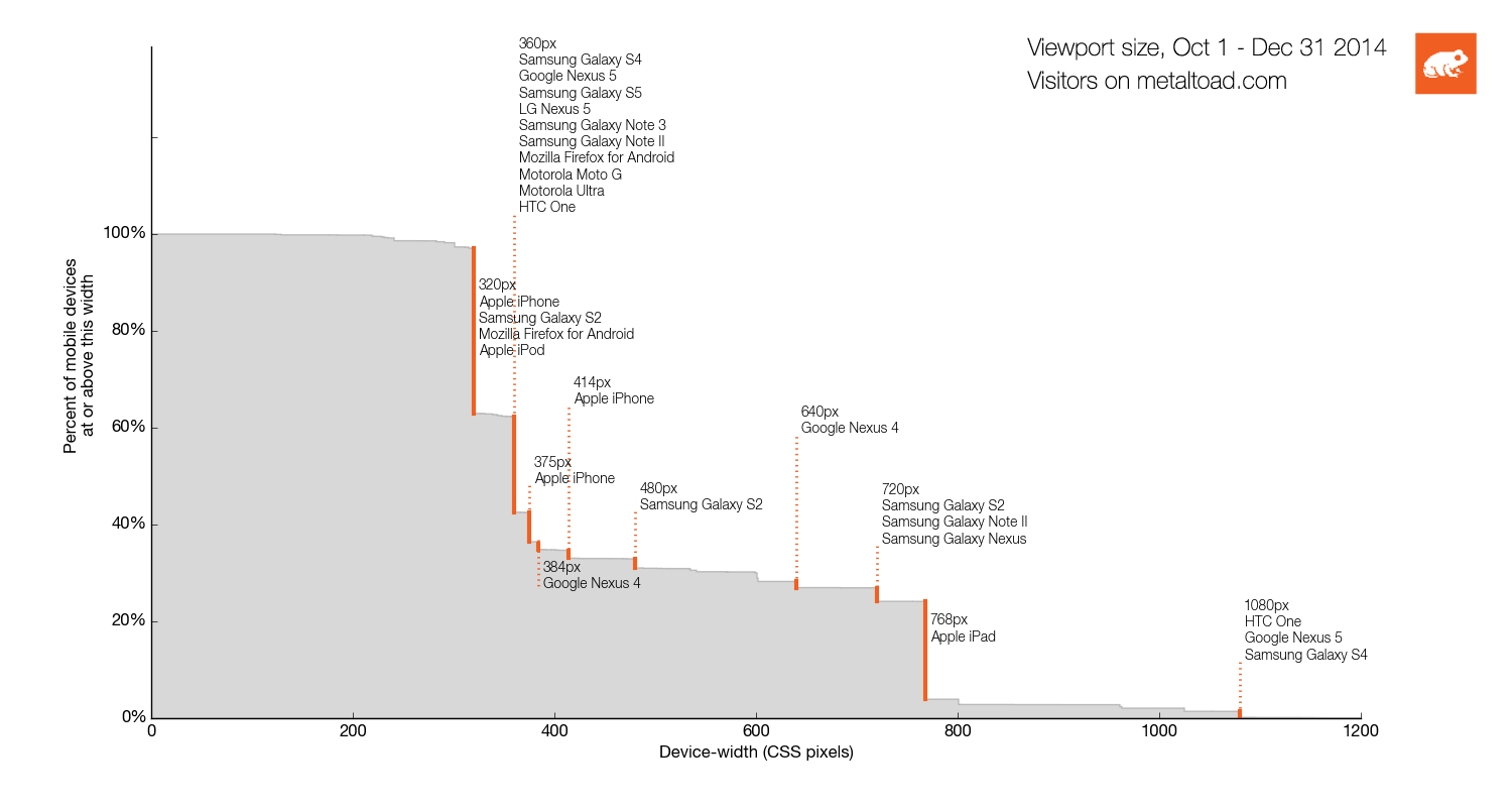
Many of our readers have asked for an update to the mobile device diagram. Rather than diagramming what handset makers are selling, I thought it would be interesting to plot what our visitors are actually using. With that in mind, here is the updated version with data extracted from Google Analytics:

Methods
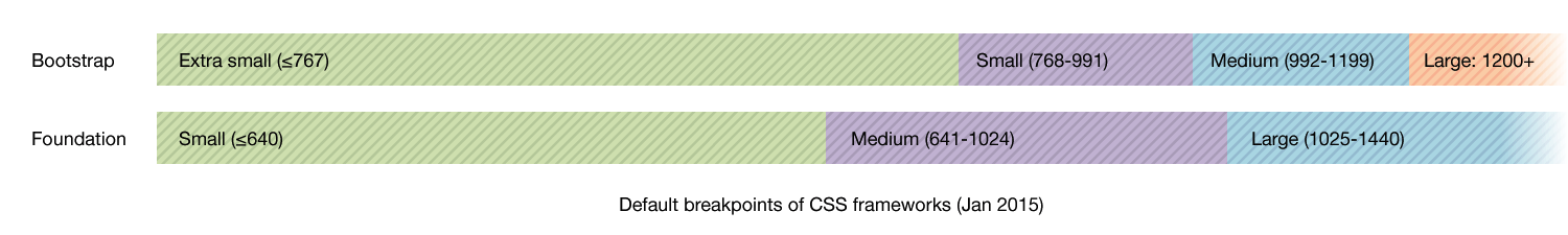
This chart shows visitors to metaltoad.com for Q4 2014. (For comparison, the defaults are lined up for the Bootstrap and Foundation CSS frameworks.) The Google analytics metrics used are "Mobile Device Info", "Screen resolution", and "Sessions". (Weirdly GA's viewportSize metric isn't available to query, so for now we can't report on desktop and larger screens). The fragmented mobile market means there's a lot of noise: For example the popular Galaxy S4 goes by many names, like Samsung GT-I9505 Galaxy S IV and Samsung SCH i545 Galaxy S4. Similar device names were grouped together, in order to produce a more readable chart.
The histogram format gives a sense of the relative prevalence of each device size. The top ten most common sizes are annotated with their sizes and popular devices. Surprisingly, some well-known brands don't make the list: For example even the most common Kindle model (Fire HD 7", at 534px) is used by only 0.005% of our audience and is an almost invisible blip. Similarly, the attention-grabbing iPhone 6 Plus (414px) is far less popular than the standard model 6 (375px).
Another thing to note is portrait and landscape are combined – so you see the iPad appear twice, at 768px and 1024px. Again, the measurements here are based on observed orientation of these devices in the wild.
A note about "retina" screens
Since about 2010, when Google introduced the Nexus One, it's no longer true that a "pixel" in CSS is always the same size as a hardware pixel. The dimensions are related by the devicePixelRatio. For example, an iPhone 6's screen is 750x1334 hardware pixels, but has a devicePixelRatio of 2.0. This means the size in CSS units is 375x667px.
In an ideal world, this new CSS unit would have a new name (and in fact this is exactly what happened in the Android SDK, where they are called "density independent pixels" or "dips"). However on the web standards change slowly, so for the sake of backwards compatibility the unit is still "px".
viewportsizes.com is a good reference; for the purposes of web design, the viewport is the number that counts, not the manufacturer's hardware specs.
Conclusions
Knowing your audience is nice…
Based on solely on this audience data (and yours will differ), I would choose the the first mobile breakpoint halfway in-between the popular phone and tablet widths. I think the Foundation default of 640px is a really good choice.
Still, obsessing over devices is short-term thinking. Content-focused breakpoints and fluid layouts will serve better in the long term.
…But breakpoints don't really matter.
You can find devices at almost every conceivable size. In many ways, planning your design around specific devices is doomed to fail (and puts you on an endless upgrade treadmill). Instead, a design should adapt fluidly within the entire spectrum. What happens in between the breakpoints is more important than the precise location of each breakpoint. (If the closest breakpoint is 200px away, are you going to waste that space on empty margins? Or use that space with a fluid layout?)