I love the Internet rabbit hole. So often I go looking for something specific and get lead down a completely different path. Sometimes that path even leads to something more useful than Plants vs Zombies.
You may have noticed, Metal Toad now has a more mobile friendly theme for our friends on the go. If you're not on the go, you can see it by resizing your browser. Go ahead, try it out, I'll wait.
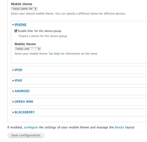
Magical right? In looking at our mobile strategy, one of the tools we considered was a Drupal Module called Mobile Tools. This module is a helper to make it easier to detect different mobile devices and respond accordingly. It offers features such as:
- Detection of the user agent
- Automatic redirection to the mobile site
- Automatic theme switching, based on device type (iPhone, Android, BlackBerry, ... )
- Integration with Panels through a Ctools plugin and for Node Displays.
- Notification for mobile users that a mobile site is available
Additionally, Mobile Tools offers a ton of granular control over things like permissions for mobile users, showing specific blocks to mobile users, and how many articles to show for a mobile homepage vs a desktop homepage.
In the world of responsive mobile design, two popular strategies are media queries and device detection. The two aren't mutually exclusive, but how you proceed will be determined by which one is more important and/or practical for your application. One of the big strengths of the Mobile Tools module is that it integrates with the WURFL* module (more on that soon) in order to detect device capabilities. As the boss likes to say, "Media queries is trying to predict the future. Device detection is dealing with the present." Can this browser handle Flash or not? Device detection will tell you, no matter the make, model or brand of device.
So if it's so great, why wouldn't you use it every time? In the case of the Mobile Tools module, one of the limitations is that it really works best for sites which have a separate url for mobile sites, with an entirely separate mobile theme. That means you've just committed to running a multi-site Drupal installation (not that big a deal), and maintaining two (or more) entirely separate themes (could be a much bigger deal).
Another gotcha to be aware of is caching issues. If you switch themes based on device type, there is a chance that caching will bypass the switch for the next user and pull the incorrect theme from the cache. This can be solved by reading the documentation in the mobile_tools_cache.inc file and adjusting your settings.php file accordingly.
What in the World Is WURFL? (And Why Should You Care?)
From Sourceforge:
The WURFL (Wireless Universal Resource File) is an XML configuration file which contains information about capabilities and features of many mobile devices.
The main scope of the file is to collect as much information as we can about all the existing mobile devices that access WAP pages so that developers will be able to build better applications and better services for the users.
The idea behind WURFL is that it allows you to test for capabilities before implementing a feature and include it in your code as an if statement, much the same way you would include conditional stylesheets for IE. Of course, if you did that for every device out there, your code would soon become unacceptably unwieldy (say it 10 times fast). The WURLF accounts for this by allowing developers to target families of devices. If someone accesses your content with a device not specifically targeted, then rendering will be based on the generic fallback standard for that family of devices.
See what I mean about the rabbit hole? I had no idea the WURFL even existed before starting to research mobile tools. The WURFL drupal module integrates with the Mobile Tools module to allow capabilities detection. Sadly, this module has not yet been ported to Drupal 7 and there's been no response from the maintainer on the issues page but he does encourage contact via twitter (@twom), if you'd like to give him a friendly nudge.
The final ingredient for use of Mobile Tools is to actually download or build a mobile theme(s) for your site. Here are a couple of mobile-ready themes which can be used as-is or as a base for your own sub-theme:
To summarize, you need three main ingredients for a successful Mobile Tools pie:
- The Mobile Tools module
- A companion module for browser or device detection such as WURFL or Browscap
- A mobile theme
Have you tried out Mobile Tools in any of your projects? What was your experience?
*Not yet available for Drupal 7