At Metal Toad we're big fans of responsive design, but a common snag in the responsive planning process comes when choosing what device widths to design to. Just yesterday we had a big internal debate over what the best widths to design to are for 3 layout sites, 4 layout sites, etc. I'll get to our conclusions below, but another important distinction to call out is that for each layout there are two things to consider: what the pixel width range for a specific layout should be, and what pixel width the designer should create the PSDs at.
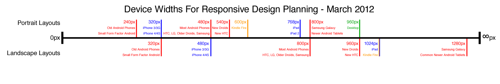
There are an ever-increasing number of devices with different screen resolutions to take into account with a responsive design, so we put together a simple but handy diagram that lists the most common device widths as of the present, along with overlays for potential device width ranges. A big shout out to creative partner Sisu for the inspiration to put this together.
The Diagram
Here's the result! You can also download it in PSD format and update it in the future with new devices or experiment with your own responsive width ranges in a visual format.
A couple of things to note:
- As the labeling indicates, the top of the diagram is portrait orientations and the bottom is landscape orientations for devices. We considered creating a more visual height/width diagram, but width is all we're concerned with in a responsive design, so putting everything on one axis made the most sense.
- iPhone and iPad (the two devices most often targeted with responsive design) are listed as 320px by 480px and 768px by 1024px respectively. For development purposes, this is still how the devices render a layout responsively, even though the newer retina displays for iPhone 4/4S and "the new iPad" have twice as many pixels horizontally and vertically. However, when it comes to PSDs, try to get them designed with a width of 640px and 1536px if possible, because you'll end up with crisper images on the retina displays when scaling down versus scaling up. The 640px and 1536px designs should be laid out as though they'll be used on a 320px/768px device though.
Our Suggested Layouts
The debate got started yesterday because we encountered a situation where only 3 layouts were called for, versus the four that Metaltoad.com is designed with. Here's what we decided on:
3 Layouts
3 layouts makes things a bit tricky, because traditionally our thought was to design for phone portrait, phone landscape, tablet portrait, and desktop/tablet landscape. The simplest solution was to combine phone landscape for larger resolution phones and tablet portrait:
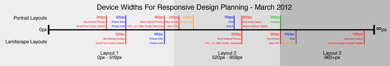
- 0-519 pixels: Most all phones in portrait mode will see the narrowest layout, and this can be a fluid-width layout to accomodate exact screen widths. Iphone landscape will still see this narrowest design.
- 520-959 pixels: Some newer Android phones with big screens and large resolutions will see the middle layout in portrait orientation, as will Kindle Fire, iPad, and most Android tablets in portrait. Most Android phones in landscape orientation will also see this layout.
- 960+ pixels: Newer big screen Android phones, Kindle Fire, iPad, and most Android tablets in landscape orientation will see the full width layout. This is also the layout that desktops will see.
Design Targets:
- Layout 1: iPhone (320/640px) in Portrait is a good candidate for the PSDs. Since this is often a fluid width layout, it can grow or shrink in width to fit other devices in this layout.
- Layout 2: iPad (768/1536px) is a good choice for the PSDs here. This layout can scale to fit other devices with the same layout.
- Layout 3: Desktop full width (960px) fixed-width with a background generally makes the most sense for PSDs.
4 Layouts
4 layouts is what we're using on Metaltoad.com. See "How we made the Metal Toad site more mobile-friendly with media queries" for details on our responsive implementation. Nearly a year of new devices later, we still like the widths we chose to use on our site for a 4 Layout approach:
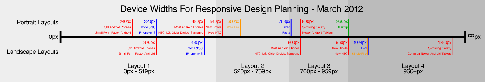
- 0-519 pixels: Most all phones in portrait mode will see the narrowest layout, and this can be a fluid-width layout to accomodate exact screen widths. Iphone landscape will still see this narrowest design.
- 520-759 pixels: Phones with large resolutions, and tablets with small resolutions (including Kindle Fire) will see this layout in portrait orientation.
- 760-959 pixels: iPad and most Android tablets will see this layout in portrait, and most Android phones will see this layout in landscape orientation.
- 960+ pixels: Newer big screen Android phones, Kindle Fire, iPad, and most Android tablets in landscape orientation will see the full width layout. This is also the layout that desktops will see.
Design Targets:
- Layout 1: Again, iPhone (320/640px) in Portrait is a good candidate for the PSDs. Since this is often a fluid width layout, it can grow or shrink in width to fit other devices in this layout.
- Layout 2: Kindle Fire at 600px is a good target device for PSDs.
- Layout 3: Again, iPad (768/1536px) is a good choice for the PSDs here. This layout can scale to fit other devices with the same layout.
- Layout 4: Desktop full width (960px) fixed-width with a background generally makes the most sense for PSDs.
6 Layouts!
Go big or go home, right? If your project budget is bottomless and you want to go for customization to the max, 6 layouts could fit the bill:
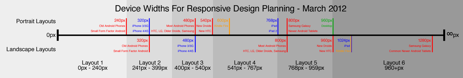
- 0-240 pixels: Older web-enabled phones and some small form factor devices will see the narrowest layout, which should probably be primarily text-based since there is little room to work with.
- 241-399 pixels: iPhones in portrait orientation get their own layout, which will also be seen on those older web-enabled phones in landscape (if such a thing exists).
- 400-540 pixels: iPhones in landscape and most Android phones in portrait would see this layout.
- 541-767 pixels: A layout just for Kindle Fire in portrait orientation!
- 768-959 pixels: iPads and most tablets in portrait orientation will see this layout, as will many Android phones in landscape orientation.
- 960+ pixels: Finally, the widest layout will be viewable on most tablets in landscape, plus desktops.
Design Targets:
- Layout 1: 240px devices are naturally the width to design PSDs to for this range, likely with a fluid layout
- Layout 2: Again, iPhone (320/640px) in Portrait is a good candidate for the PSDs for the 240-400px width range.
- Layout 3: This design can probably be very similar to layout 2, but targeted at 480px Android phones in portrait.
- Layout 4: A design just for Kindle Fire (600px) in portrait.
- Layout 5: Again, iPad (768/1536px) is a good choice for the PSDs here.
- Layout 6: Desktop full width (960px) fixed-width with a background FTW!
What are Your Responsive Widths?
Hopefully that info was useful info if you're new to designing and developing for responsive width ranges with target widths for designs. If so, definitely grab the diagram PSD and put it to good use. If you are experienced with designing for responsive and either agree with us or disagree entirely, I hope you take the time to leave a comment with your thoughts!
Want more awesome content like this? Subscribe to our newsletter!