When you’re making a basic, edge-to-edge UICollectionView in interface builder, Xcode has a habit of describing it using negative margins. In most scenarios, this would be fine, but the internal mechanisms Apple uses for caculating a UICollectionViewFlowLayout falls apart when presented with negative margins.
Lets look at an example collection view. We’ll start by dragging a collection view to the four edges of a view controller, then add some autolayout constraints:
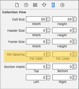
Now we’ll tweak the default spacing a bit:
Then we’ll hook up our delegate and data source to our view controller, and fill in some methods in our controller:
import UIKit

class ViewController: UIViewController, UICollectionViewDataSource, UICollectionViewDelegate, UICollectionViewDelegateFlowLayout {

    func collectionView(collectionView: UICollectionView, cellForItemAtIndexPath indexPath: NSIndexPath) -> UICollectionViewCell {
        let cell = collectionView.dequeueReusableCellWithReuseIdentifier("cell", forIndexPath: indexPath)
        cell.backgroundColor = UIColor.greenColor()
        return cell
    }

    func collectionView(collectionView: UICollectionView, numberOfItemsInSection section: Int) -> Int {
        return 8
    }

    func collectionView(collectionView: UICollectionView, layout collectionViewLayout: UICollectionViewLayout, sizeForItemAtIndexPath indexPath: NSIndexPath) -> CGSize {
        return CGSizeMake(self.view.bounds.size.width / 2 - 1, 100)
    }
}
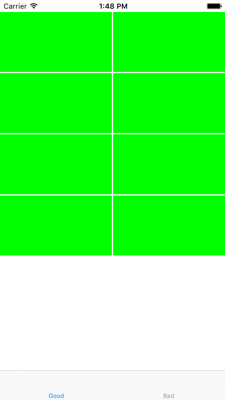
Given those spacing constraints, and the logic in sizeForItemAtIndexPath, we’d expect to see two columns of cells, running edge-to-edge, with a 2 pixel gutter down the center, and 2 pixels vertically between each cell.
Instead, we see this:
Here’s the reason that happens:
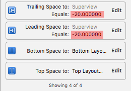
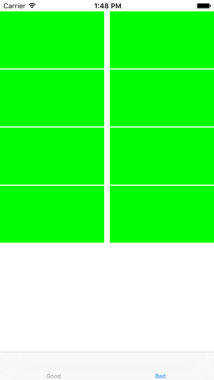
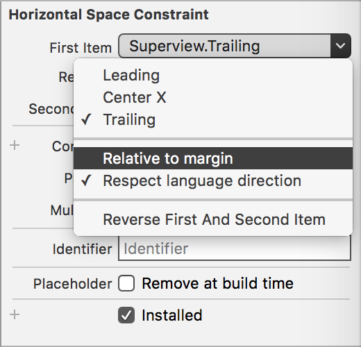
By default, Xcode marks any constraints you place on your root view’s leading or trailing edge as “Relative to margin”. This breaks the layout engine’s calculations, and ends up giving you a much bigger-than-expected gap. To fix it, we’ll simple uncheck the “Relative to margin” option:
Now our view looks exactly like we’d expect: