Artificial Intelligence
What Makes HTML5 so Great?
When the W3C started working on HTML again in 2007, they posted a set of guiding principles for the new version, emphasizing compatibility
Our new site design is live, so if you're reading this in a feed reader, please click on through!

Our new site design is live, so if you're reading this in a feed reader, please click on through! In a nutshell, we wanted to redesign to take advantage of Drupal 7, HTML5, and dramatically improve the readability and usability of the site as a whole.
The redesign was a perfect excuse to use Drupal 7 on a new site. It wasn't the easiest site we've ever set up, since D7 isn't even in beta yet, but the core product was surprisingly easy to work with. The real problem is that some of the modules we rely on aren't quite ready for prime-time yet. For example, Views doesn't even have an alpha of their D7 version up yet. The dev version works for the most part, but we bumped up against some real problems. Thankfully, our programmers were smart enough to find a solution to every problem I threw their way — and Dylan even contributed a fix back to Views!
In a nutshell, I'd say that the whole experience has made me even more excited to start using D7 for clients, but also cautious about doing so. It's definitely a work in progress, but when it's ready, our clients are going to love it. The improvements to the admin side alone are worth the upgrade. All that #D7UX work has really paid off.
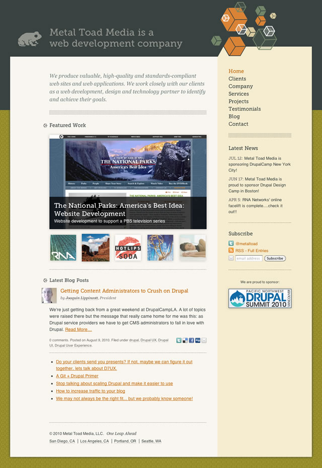
Since our website should serve as a model for the kind of work we can do for a client, I wanted to use HTML5 development in the redesign. These things tend to take on a life of their own, however, and instead of just converting our template, we created Boron, a new HTML5 base theme for Drupal 7. The design you're looking at right now is a sub-theme built on top of Boron, and we've got big plans. Soon, we're going to create a D6 version, and also port it to Wordpress.
For the most part, we're just using the new doctype and taking advantage of the new semantic elements. But really, we've laid the groundwork for the future, and we'll be able to implement all the new HTML5 goodies as they become supported in more browsers.
If you're interested in the work we did, be sure to check out the talk I gave at DrupalCamp LA about how to use HTML5 in Drupal. You can also download Boron to use on your own site.
One of the things I really wanted to improve in the new site was our typography. The old version of the site used a 10.5px font size, which felt unnecessarily cramped. I kicked it up a couple notches to 14px (actually it's measured in ems, but let's not get distracted) and increased the line-height to 1.5. It's a simple change, but by giving the text more room to breathe, the whole site feels better.
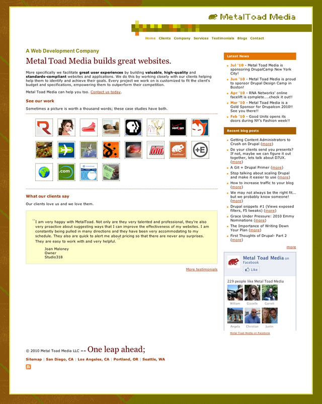
Good author photos on a company blog are like feta on pasta. If they're missing, it won't stop you from reading, but when they're there, it makes everything better. We're hard-wired to communicate visually, and when you can see the face of the person you're "talking to," it makes it easier to connect with them. Our previous site had photos, but they were all run through a late-90s hotwired.com-style filter with a pixelated green tint. While there's something to be said for the uniform style, I think one of the key features of an author photo should be that when you meet that person at a conference, you're able to recognize them. When we started on this redesign, I pushed hard to get good quality photos taken of everyone, and I think it's really paid off. Check out the Company page or Blog to see what I mean.
I'm especially pleased with our profile pages. First of all, it's got a nice big photo. In most cases, a more relaxed or casual shot than we used for the avatar (Dylan and Joaquin are my favorites). In addition to the bio, we've got links to various social networks (and their drupal.org profile!), and we pull in their latest tweets. We're planning to expand this soon to also display recent blog posts.
The area we probably invested the most time in was the blogs. A great deal of the traffic on our site goes straight to a blog post, bypassing the front page and blog page entirely, so we put some extra effort into making the blog post pages better. Aside from the giant headline, my favorite feature is the "About the Author" block that appears below the post. It pulls in the brand-new photos we took for everyone on the team, shows their bio, and links back to the author's profile page and also more posts by that author. Hopefully, these links will allow these direct-to-the-blog visitors to find more content that they'd appreciate.
We also tweaked the comments to work more like the way Wordpress handles them. Now, if someone from Metal Toad leaves a comment, it shows their photo and links to their profile page, but for anonymous users, we link to their website (if they provide one) and use their email address to pull up their Gravatar photo. It's a subtle thing, but I love having those photos next to our visitors' comments. It really makes the conversations feel more personal.
When the W3C started working on HTML again in 2007, they posted a set of guiding principles for the new version, emphasizing compatibility
Discover why HTML5 is essential for businesses, offering cost-effective, cross-platform development and competitive advantages over traditional...
Alarmist rhetoric from news organizations about the web is nothing new, but today's front-page headline on the New York Times still caught my eye: "