Table layouts have been passé since the introduction of CSS. "A table should only contain data!" say the purists. But it had some major advantages over the block model of CSS. Ever tried to center align a div? It's not as easy as 'align=center' was. how about the classic "Columns stretching to match height"? Tables had "height=100%" and it would take up 100% of the available space.
Don't get me wrong. I didn't get left behind. All of my sites these days use CSS exclusively and I haven't used a table for layout in years. But the possibilities of the flexible box model in CSS3 has me dreaming of days gone by. Here are some things that flex box will bring to the table:
Auto stretching both ways
I've given the container a width, height, and display:box, but the children only have box-flex:1. That's it.
<style>
.box {
width:500px;
height:200px;
display:-webkit-box;
display:-moz-box;
display:box;
}
.horizontal {
-webkit-box-orient:horizontal;
-moz-box-orient:horizontal;
box-orient:horizontal;
}
.flex1 {
-webkit-box-flex:1;
-moz-box-flex:1;
box-flex:1;
}
.w50 {
width:50px;
}
.blue {background:#00F;color:#FFF;}
.green {background:#0F0;color:#000;}
.red {background:#F00;color:#FFF;}
.yellow {background:#FF0;color:#000;}
</style>
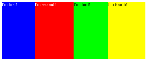
<div id="container" class="box horizontal stretch">
<div class="flex1 blue">I'm first!</div>
<div class="flex1 red">I'm second!</div>
<div class="flex1 green">I'm third!</div>
<div class="flex1 yellow">I'm fourth!</div>
</div>
And this produces four boxes, equally stretching across the container.
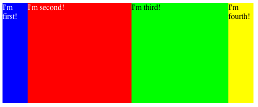
Let's switch a few things around now. Let's say you want two columns of 50px on either end, and two equal width columns in the middle. The only change is to give widths to elements that need them and remove the flexing:
<div id="container" class="box horizontal stretch">
	<div class="w50 blue">I'm first!</div>
	<div class="flex1 red">I'm second!</div>
	<div class="flex1 green">I'm third!</div>
	<div class="w50 yellow">I'm fourth!</div>
</div>
Bam! Done!
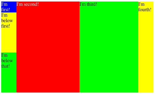
Let's add some vertical boxes like so:
.vertical {
  -webkit-box-orient:vertical;
     -moz-box-orient:vertical;
          box-orient:vertical;
}
<div id="container" class="box horizontal stretch">
	<div class="w50 blue vertical box">I'm first!
	  <div class="yellow flex1">I'm below first!</div>
	  <div class="green flex1">I'm below that!</div>
	</div>
	<div class="flex1 red">I'm second!
	</div>
	<div class="flex1 green">I'm third!</div>
	<div class="w50 yellow">I'm fourth!</div>
</div>
And this produces:
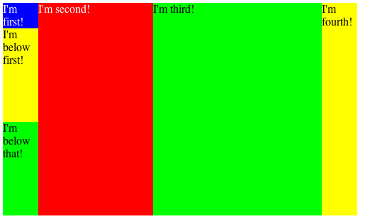
Now we'll make one middle column stretch more than the other:
.flex2 {
-webkit-box-flex:2;
-moz-box-flex:2;
box-flex:2;
}
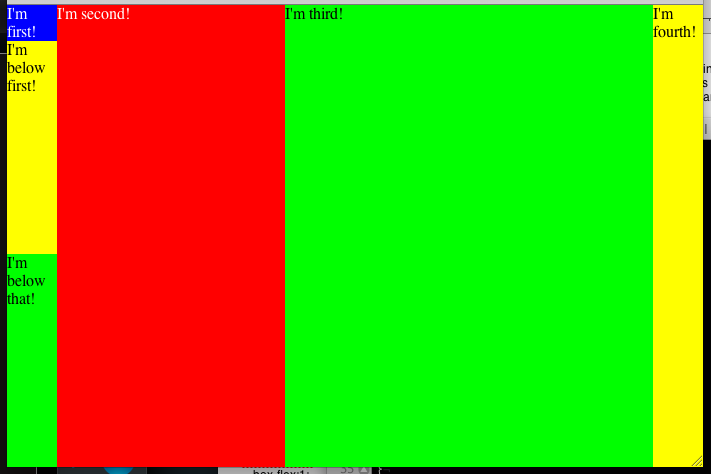
<div id="container" class="box horizontal stretch">
<div class="w50 blue vertical box">I'm first!
<div class="yellow flex1">I'm below first!</div>
<div class="green flex1">I'm below that!</div>
</div>
<div class="flex1 red">I'm second!
</div>
<div class="flex2 green">I'm third!</div>
<div class="w50 yellow">I'm fourth!</div>
</div>
Want to do something fancy? Try applying flex box from the body down. Everything gets stretchy!
I remove the width and height from the container and add the flex1 class. Then add box flex to the body!
body {
  width:100%;
  height:100%;
  display:-webkit-box;
  display:-moz-box;
  display:box;
  margin:0px;
}
.box {
  display:-webkit-box;
  display:-moz-box;
  display:box;
}

<div id="container" class="box horizontal stretch flex1">
	<div class="w50 blue vertical box">I'm first!
	  <div class="yellow flex1">I'm below first!</div>
	  <div class="green flex1">I'm below that!</div>
	</div>
	<div class="flex1 red">I'm second!
	</div>
	<div class="flex2 green">I'm third!</div>
	<div class="w50 yellow">I'm fourth!</div>
</div>
As you can see, this is going to re-revolutionize our layouts. Still get semantic markup, but the flexibility we had ten years ago. And there's a lot I didn't cover, like changing the order of divs using box-ordinal-group and making them line up at the bottom with box-align. All good things.
I know what you're thinking now. What about the IE elephant in the room? That's where a great shim called flexie comes in. Hop over to http://flexiejs.com/ to make IE behave.