Design
Thumb Zone
Discover how ergonomics and software design converge in mobile UX with insights on the thumb zone and its impact on users from expert designer Cami...
Discover essential design tips for creating user-friendly iOS and Android apps, including working with developers, using grids, and understanding platform guidelines.

Recently I've been designing a few mobile apps. The first app was designed from scratch for both iOS and Android. The other was taking a pre-existing iOS app and translating the design and UX to be more suited for Android. It's been an interesting process that has taught me a lot about the differences and similarities of the two different platforms. I've also been discussing, sharing, and working directly with both iOS and Android developers to create the best experience on both platforms. I’d like to share some tips I’ve learned.
You have two options when you embark on designing an app for both iOS and Android.
1. Use one design on both platforms
2. Design specifically for each OS separately
Don’t try to use one design for both OS’s. You will provide a poor experience on both platforms. You might also increase development time by forcing developers to create custom components. It does not take much work to design for each individual OS.
In the end the designs will likely not be that different, but there are small key differences that will greatly improve the usability, recognizability, and feel of your apps for their specific OS.
Both iOS and Android have their own design systems and guidelines. Get to know them. Android mostly relies on Google’s Material Guidelines and Apple uses their Human Interface Guidelines.
There are many good and free UI kits that you can use to get the project started and finished quicker for both Android and iOS. I usually use the ones that come with Sketch. I will also look on Sketch App Sources for ideas.
Don’t get confused
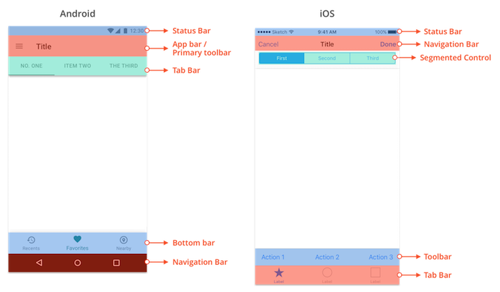
It can sometimes be confusing when talking about the basic elements of mobile interface when you include both Android and iOS. Android and iOS name similar items differently and give the same name to different items.
Learn how to communicate between the two guidelines, and more importantly, decide on a naming pattern that your whole team understands!

As you should always be doing, create good relationships and workflows with your developers. It doesn’t matter how long you read over each platform’s guidelines, your developer is probably going to know more. Ask them what they think. Ask them for ideas. Listen to what they say, and if they are not saying anything, ask them constantly what they think.
Developers are going to have a better idea of what is easy or more difficult to build. Make sure you understand how custom the components you are designing are and how they will affect development time. Sometimes it is better to spend the time creating something completely custom and other times it doesn’t make sense. Use the baked-in solutions if they accomplish what you need. They are going to be intuitive, easy to develop, and much less likely to be buggy. It will cut development time greatly.
Using basic components does not mean you are stuck with them either. It gives you time to understand what works and what doesn’t. The code will be in a much better place to iterate and build on top of. If you first go for a custom solution and change your mind later, that code will most likely be useless. If you go with a baked-in pattern development you will probably have a good base to work on top of.
If you want the app’s design to look like your beautiful comps, pair with your developer. Sit down together and talk about colors, fonts, and spacing.
A really good way of documenting your design is to use Zeplin. This gives the developer easy access to assets and automatically redlines your design for them. It is also easy to keep your designs updated and fresh.

Do you need a grid? No, but it will make your life easier. You want consistent and logical spacing across each platform. When working with developers you will need to give them specifics on spacing and sizing. Using a grid will help standardize this for you and your developers’ sanity. However a grid will not solve all your problems.
You need to have a good understanding of how most of your elements will respond to different device widths. You will need to know where you want fixed spacing and where you want flexible or relative spacing. So always be thinking about the different sizes a device can be. A great way of testing how elements might respond is to use Sketch’s Resizing Constraints which actually works very much like how you might lay things out in Android Studio.
Material Guidelines recommends a 8dp grid and 4dp spacing for icons and types alignment. iOS is not as specific about spacing but you will probably end up using a different grid for each platform. I used an 8px grid on Android and a 5px grid for iOS in Sketch.
.jpg)
You will be partial to one platform. If you have an iPhone make sure you get an Android test device or vice versa. Download apps on it and use it. Play around with your alien new piece of technology. Compare apps and how they differ on each platform.
You also want to be looking constantly at your designs on each test device. I can tell you from personal experience that a design will look different when you are looking at it on your computer screen versus on the actual device you are designing for.
Create prototypes and put them on your phone to get a feel for the app you are designing. See if the flow that you are designing makes sense. Clicking through a prototype on the actual device you are designing for will give you insights into things that you have overlooked or missed. It will also really help you see if the content you have designed for is readable and browsable.

Designing for Android and iOS is a fun adventure. How it’s best done will differ depending on your UX style, your team, and the needs of the project. Every day I work on creating an Android or iOS app I learn something new about each platform and myself. The lines that make each platform different are blurring. Heavily used apps like Twitter are blurring the lines further. Either way, designing for either platform or for both will teach you a lot about design, usability, and what your preferences are.
Designing native apps for Android and iOS: key differences and similarities (Sept 20, 2016, by Bruno Müller) - An awesome overview of the two platforms.
Android vs. iOS: How to Create a Habitual UI (June 22, 2016, by Nazar Konashevych) - A great side-by-side comparison of Android versus iOS patterns.
Developing for Android vs. iOS: Navigation Patterns (Oct 25, 2016, by Jordan Réjaud) - A more in-depth side-by-side comparison of Android versus iOS patterns.
Discover how ergonomics and software design converge in mobile UX with insights on the thumb zone and its impact on users from expert designer Cami...
The essential guidelines for planning responsive web designs with a focus on ideal device widths, ensuring optimal experiences across all screen...
Samsung Music's new site utilizes HTML5 and responsive design on Drupal, showcasing GPU acceleration for Android devices. Learn how modern design...