Artificial Intelligence
Visual Regression Testing with BackstopJS
Fun fact: The creator of BackstopJS has referenced this blog post as the recommended tutorial for BackstopJS v2!
This tutorial is obsolete for the new version of Breakpoint Panels - New tutorial to come
Breakpoint Panels is a new module just released that allows you to specify which panels show in which breakpoints. It integrates with the Breakpoint module, Panels, and specifically the Panels In-Place Editor. In this post, we'll walk through how to use it.
There are a few Drupal requirements to get it going, including Breakpoints, Panels, Panels In-Place Editor (Included with Panels), and Libraries. Once those are in place, download the JavaScript libraries enquire.js and mediaMatch.js and put them in your libraries folder. Enquire.js allows JavaScript to use breakpoints and react when they are activated via a resize. MediaMatch.js is a polyfill to make this work on IE. For a bonus, use the font-awesome library.
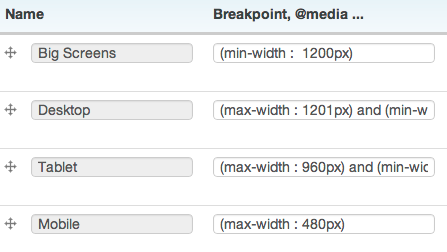
Once everything has been installed and enabled, it's time to set up your breakpoints. For this example I've chosen 4 breakpoints and named them Mobile, Tablet, Desktop, and Big Screen. I chose to explicitly specify the end and beginning for the middle two.
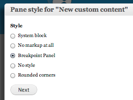
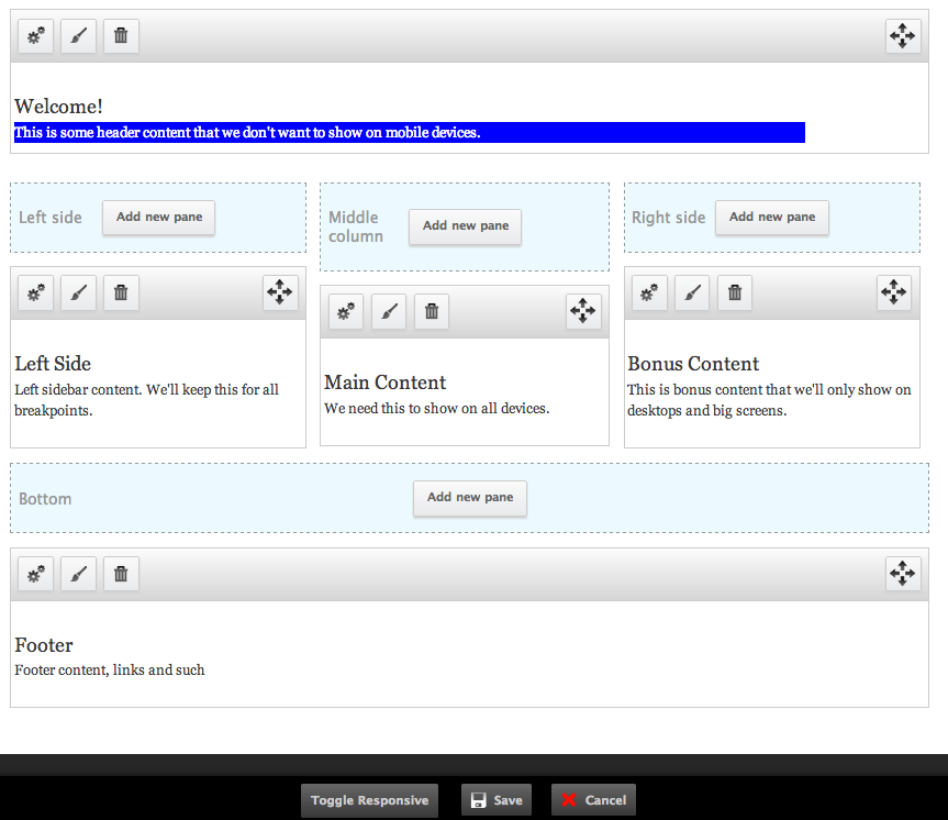
Now that the breakpoints are set up, go to one of our panel pages and select "Customize this page" to open the in-place editor and change the style to Breakpoint Panel.
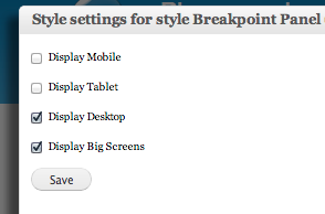
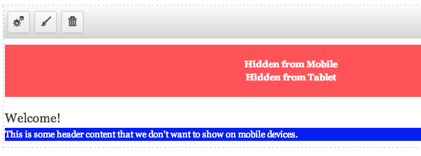
Select which breakpoints you want the panel to show on. They're all checked by default. You'll see in the second image that it has added a label that says "Hidden from Mobile" and "Hidden From Tablet".
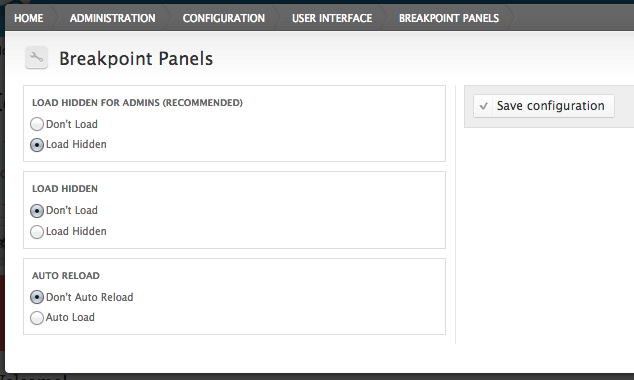
Breakpoint Panels has three configuration options:
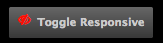
By default, when you open the In-Place Editor it shows all content, regardless of breakpoints. Breakpoint Panels adds a button to the In-Place Editor named "Toggle Responsive". When this is clicked, it hides the panels that would normally be hidden at those breakpoints. This allows you to toggle between seeing all content and the content for the particular breakpoint. While toggled, resizing the browser will hide and show the content depending on the breakpoints.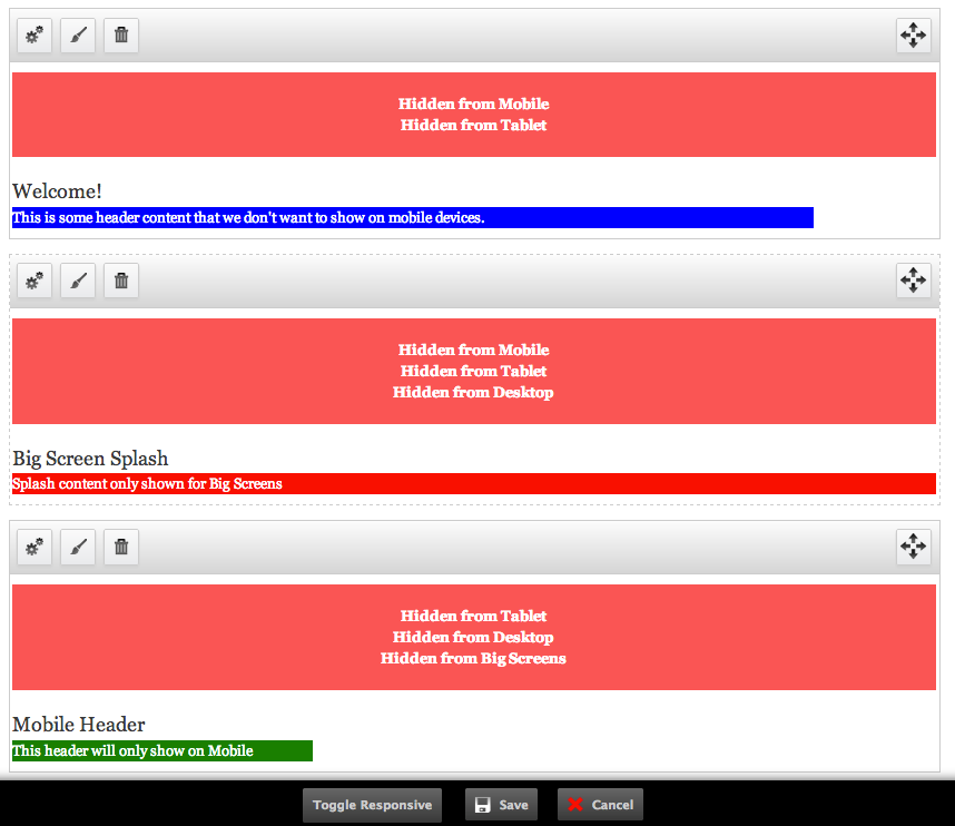
If you install the font-awesome font library, the button will have a cool eye icon (eyecon?).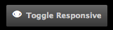
That's all you need to have different content at different breakpoints. If you have any questions, please leave a comment. If you find any bugs, please report it on the module issue page.
Fun fact: The creator of BackstopJS has referenced this blog post as the recommended tutorial for BackstopJS v2!
Now that Entityqueue has been released, I wanted to give a quick tutorial on how to use it.
It can take a while when you're new, but once you start to wrap your head around Views, that is when Drupal gets really fun. In this tutorial, I'll...